DISCLAIMER: Potterworld or Droobledore LLC is not in any way affiliated with Mojang AB, J.K. Rowling, Warner Brothers or any company, copyright or trademark.
PotterworldMC PotterworldMC PotterworldMC

Banner texture

Ivan_

Professor
Minecraft IGN: _Navyy
Auralock Griffin Phoenix Vampire Werewolf
#1
So I understand why the banner textures were changed, but I don't think it was executed as well as it could've been. The main issues I have are:
1. The Hogsworth banners with the Potterworlds logo simply don't look good. Something should've been added to background and the logo itself doesn't translate well onto a pixeled banner.
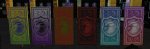
2. Certain color combos between logo and background look weird for some reason. Here's some examples of good looking banners (right) and bad looking banners (left). I don't necessarily think this issue HAS to be changed but it's just something to keep in mind when making future banners (I believe the issue is when the logo is darker than the background - but it's also the texture of the banners).
 

Attachments

Lynn

Graduate
Minecraft IGN: Mireiia
Auralock Dark Follower Phoenix Serpent Vampire
#2
Hey there @Ivan_ !

Thank you for bringing this up! We always try to create different banners for each event, which requires us to come up with new combinations and looks. However, we definitely agree that some of the banner colors have not been the clearest or best matching in the past. Therefore, we will be marking this as feedback and taking these specific points with us for future and general color coordination in banners and we will be more vigilant with banner creation for future events.

Thank you once again for your feedback and I hope you have an amazing day!!
 

Ivan_

Professor
Minecraft IGN: _Navyy
Auralock Griffin Phoenix Vampire Werewolf
#3
Hey there @Ivan_ !

Thank you for bringing this up! We always try to create different banners for each event, which requires us to come up with new combinations and looks. However, we definitely agree that some of the banner colors have not been the clearest or best matching in the past. Therefore, we will be marking this as feedback and taking these specific points with us for future and general color coordination in banners and we will be more vigilant with banner creation for future events.

Thank you once again for your feedback and I hope you have an amazing day!!
Thanks. I think the color thing is more noticeable now with the new textures.
What about the Hogwarts banners, any info on that? I didn't put screenshots in my original post bc i thought it wasn't needed, but i still think that specific texture needs a change for sure
 

Ivan_

Professor
Minecraft IGN: _Navyy
Auralock Griffin Phoenix Vampire Werewolf
#4
I saw that the Hogwarts banners just got a rework, I will say they look much better now. Thanks