


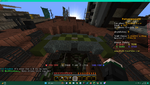
In short, I can't read them. The lettering on the default signs is very small and the signs themselves are very high. Banners would probably take up too much space, but maybe utilizing maps in a creative world, or customs signs of some kind to make them actually readable? This isn't just a problem in Diagonal Lane, but it's most obvious there where the doorways are all super high up.
Attachments
-
 1.6 MB Views: 390